2026 Wedding Color Trends: How to Design a Multi-Color Palette
January 12, 2026
Words by
Photos courtesy of
For years, wedding color palettes followed a familiar formula. Pick two colors. Make sure one is neutral. Hope nothing clashes. Repeat forever. In 2026, that formula is officially toast.
Couples are no longer asking, “Do these colors match?” They’re asking, “How do I want this to feel?” And that subtle shift has blown the doors wide open. Instead of tidy pairings, we’re seeing layered palettes that mix tones, textures, and unexpected hues that feel collected rather than coordinated.
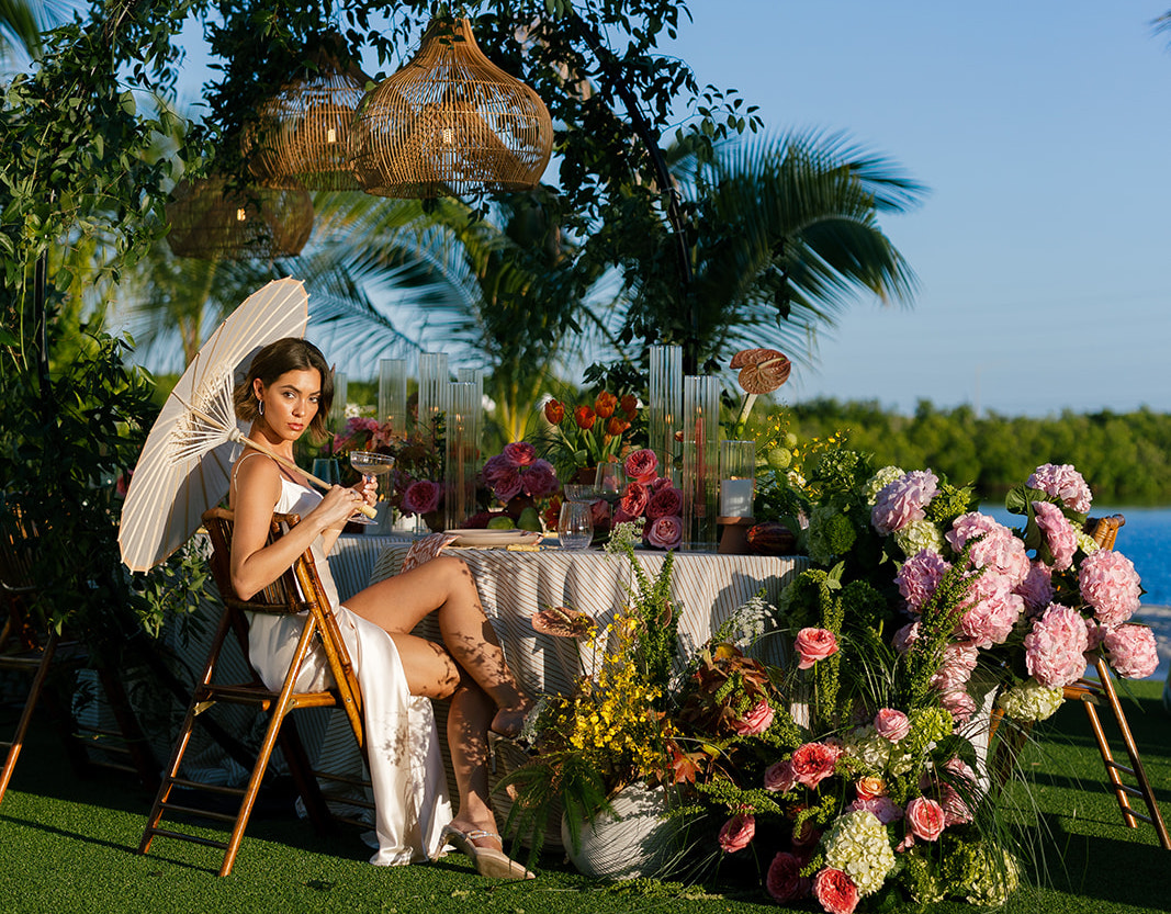 Photo by Alyssa Morgan Photography, Courtesy of Vicky Furman Events
This doesn’t mean chaos. It means intention. The new standard is multi-colored, but with meaning. Think less “Pinterest-perfect swatch set,” more “this reminds me of who we are.”
As McKenzi Taylor, Founder and Owner of Cactus Collective Weddings, puts it, “The single biggest change I’ve noticed is more couples using multi-color color palettes… It’s OK to branch out into these wilder mixes.”
Amos Gott, Chief Event Architect at AmosEvents, agrees, noting that couples are finally letting go of fear-based design. “Couples are finally moving away from the ‘one safe neutral and a prayer’ approach and leaning into richer, more dimensional palettes that feel personal rather than Pinterest-approved.”
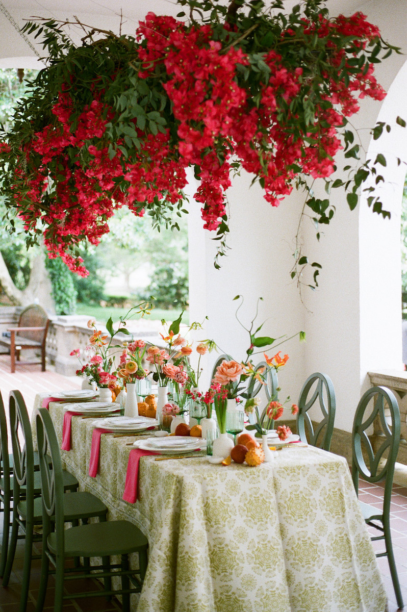 Photo by Laura Memory Photography & Videography
“Couples are embracing vibrant pinks, red-orange ‘paloma hues,’ and cobalt blue in place of traditional neutral tones, using color as a storytelling tool rather than a backdrop,” Kimberly Snelson, Weddings & Special Events Manager at Sandestin Golf and Beach Resort, adds.
How to Avoid the “Dated” Look: Anchoring the Trend
Let’s address the quiet fear living in everyone’s head: “Will this look dated in ten years?”
The answer is yes. And also… that’s fine. The key isn’t avoiding trends altogether. It’s knowing how to use them without letting them take over the room. Think of trendy colors like seasoning. A little transforms the dish. Dump the whole jar, and no one’s having a good time.
Designers recommend anchoring bolder or more playful hues in places that are easy to swap or visually lighter. Florals, paper goods, signage, napkins, and escort displays; these are the places where color can flirt without committing long-term.
 Photo by Brianna Vögeli Photography
Meanwhile, your heavy hitters like tables, flooring, architecture, and linens stay rooted in classic textures and tones. As Gott explains, “The trick is to anchor trendy tones with timeless neutrals and classic textures so the overall look feels intentional rather than timestamped.”
And if you’re still nervous? Carmen Hinebaugh, Owner & Lead Planner of Evermore Occasions, offers a gentle reality check: “Your wedding happened in 2026, and the photos will end up reflecting that… and I don’t think that’s something to run from.”
Your wedding isn’t meant to exist outside of time. It’s meant to exist inside your story and your timeline.
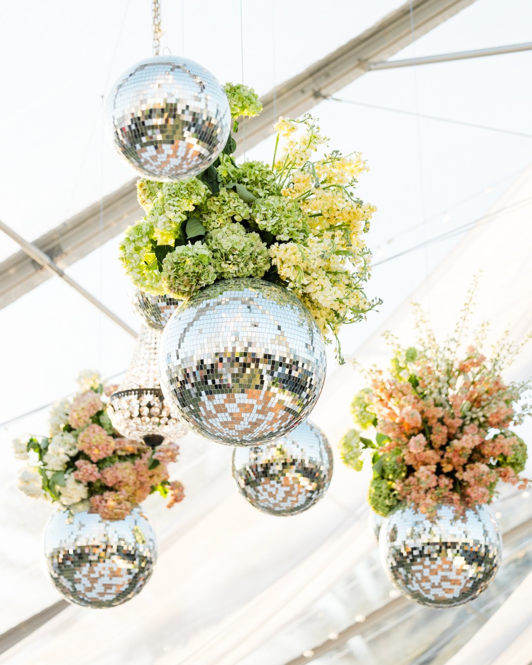 Photo by Oxana Rox Photography
The Secret to Multi-Color Sophistication: Hierarchy and Harmony
Here’s where multi-color palettes either soar or spiral. The secret is hierarchy.
That hierarchy doesn’t happen by accident. It’s the result of understanding how colors interact, balance, and play off one another. As Irene Katzias, Wedding Designer & Founder of Irene + Co Events, explains, “A firm grasp of color theory is crucial for designers aiming to craft a harmonious color palette… Don’t shy away from experimenting with various patterns and color combinations; this adventurous approach can lead to innovative and multidimensional designs.”
In other words, multi-color works best when creativity is paired with intention. The magic isn’t in using fewer colors, but in knowing how to let them talk to each other.
Jaclyn Watson, Wedding Planner & Owner of Jaclyn Watson Events, echoes this approach with a practical framework: “A multi-color palette looks sophisticated when there’s a clear order. I suggest using one main color, one supporting color, one accent color, one strong neutral, and one metallic.”
Another elevated move we’re seeing in 2026 is letting the palette evolve throughout the day. Ceremony designs lean softer and calmer. Cocktail hour introduces contrast and playfulness. The reception is where everything comes together in full color harmony.
The result feels immersive rather than overwhelming, like a story that builds instead of shouting its ending in the first chapter.
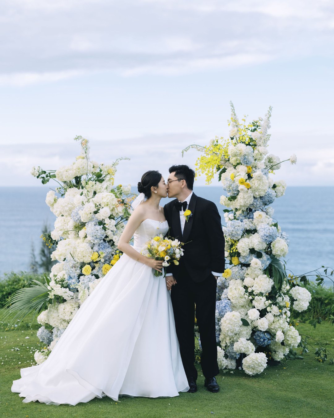 Photo by Leeson Liu Photography
Inspiration Beyond the Screen: Looking Inward
If Pinterest is starting to feel like static noise, you’re not alone. Endless scrolling can flatten even the most thoughtful design instincts.
The antidote? Look at your real life. Open your closet. Notice what colors you reach for again and again. Look at your home. Scroll through your travel photos. These are the palettes that have already stood the test of time for you.
Gott offers one of the best gut-checks out there: “If you would not hang it on your wall, you probably should not build a wedding around it.”
And when social media truly overwhelms, history becomes a surprisingly grounding guide. Art movements, architecture, and classic design references remind us that color confidence didn’t start with Instagram.
As Taylor notes, “What’s worked for generations still works today when it comes to colors… If a couple is overwhelmed by what they’re seeing online, then I point them to historical references.”
Turns out, inspiration ages better than trends.
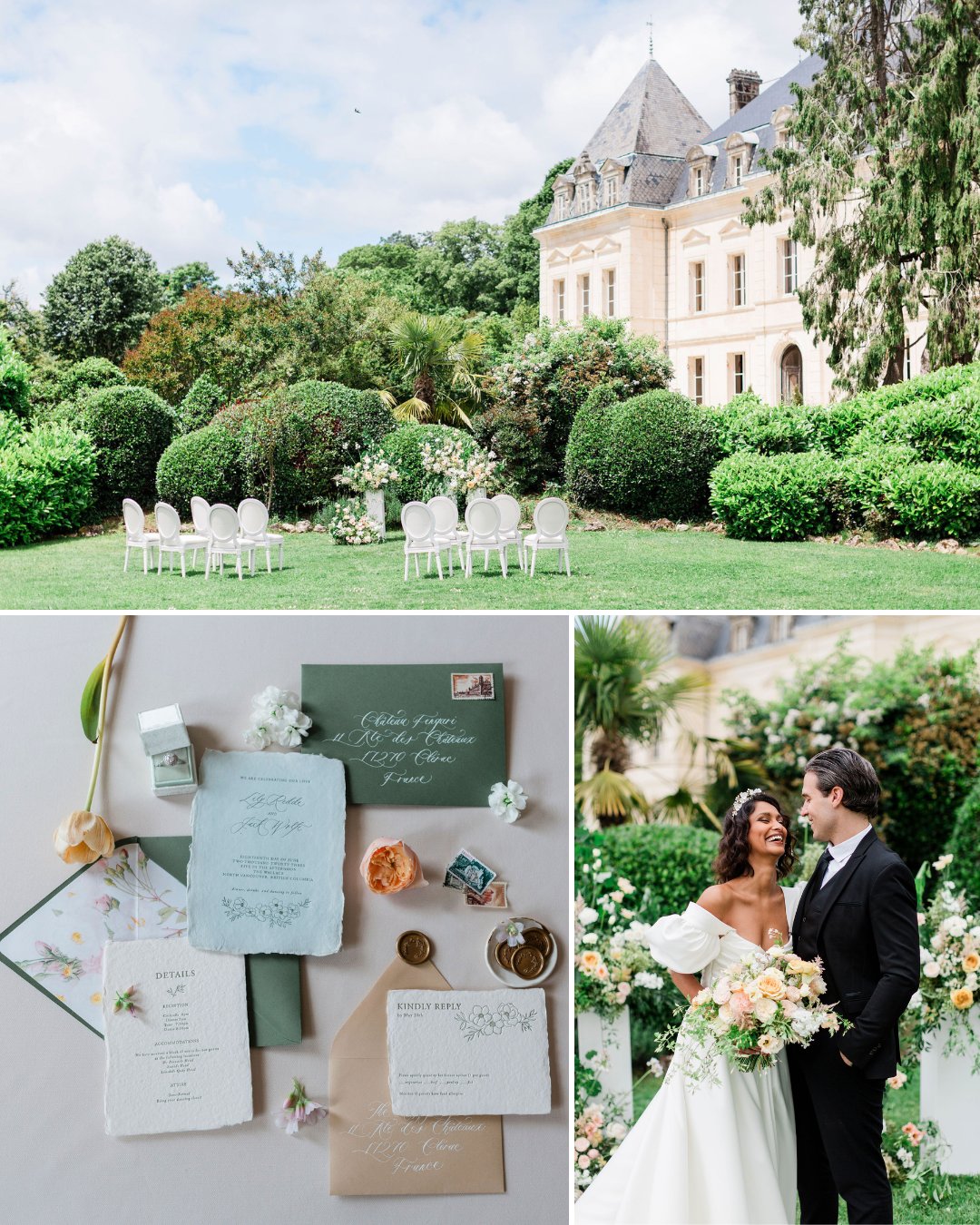 Photos by Véronique Chesnel Photography
Destination Design: Inspiration, Not Imitation
The wedding’s location should inform your palette, not dictate it.
Textures, undertones, and natural light can all guide your choices without locking you into local clichés. As Gott puts it, “A destination should inspire your palette, not hold it hostage. Use the landscape as a guide… then layer in colors that reflect your personality and story.”
Kelley Nudo, Client Relations & Operations Director at Momental Designs, reinforces this idea with a reminder that tradition doesn’t mean repetition. “Not every wedding in Greece… was white with cobalt blue… Couples can be adventurous and deviate from the expected.”
The most compelling destination designs feel rooted, not themed. They belong to the couple first, the place second.
 Photo by Petar Jurica
The Takeaway
Wedding color trends in 2026 aren’t about chasing the next “it” palette. They’re about permission. Permission to mix. Permission to feel. Permission to design something that doesn’t fit neatly into a preset box.
The safest choice now? Choosing what actually feels like you, and letting the colors follow!
Featured Image by Ildefonso Gutierrez