High Fashion Wedding Ideas For 2021
September 3, 2021
Words by
Photos courtesy of
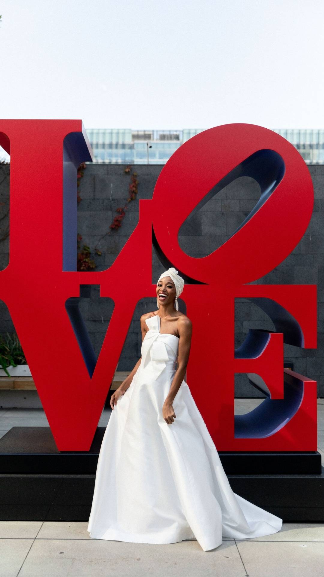
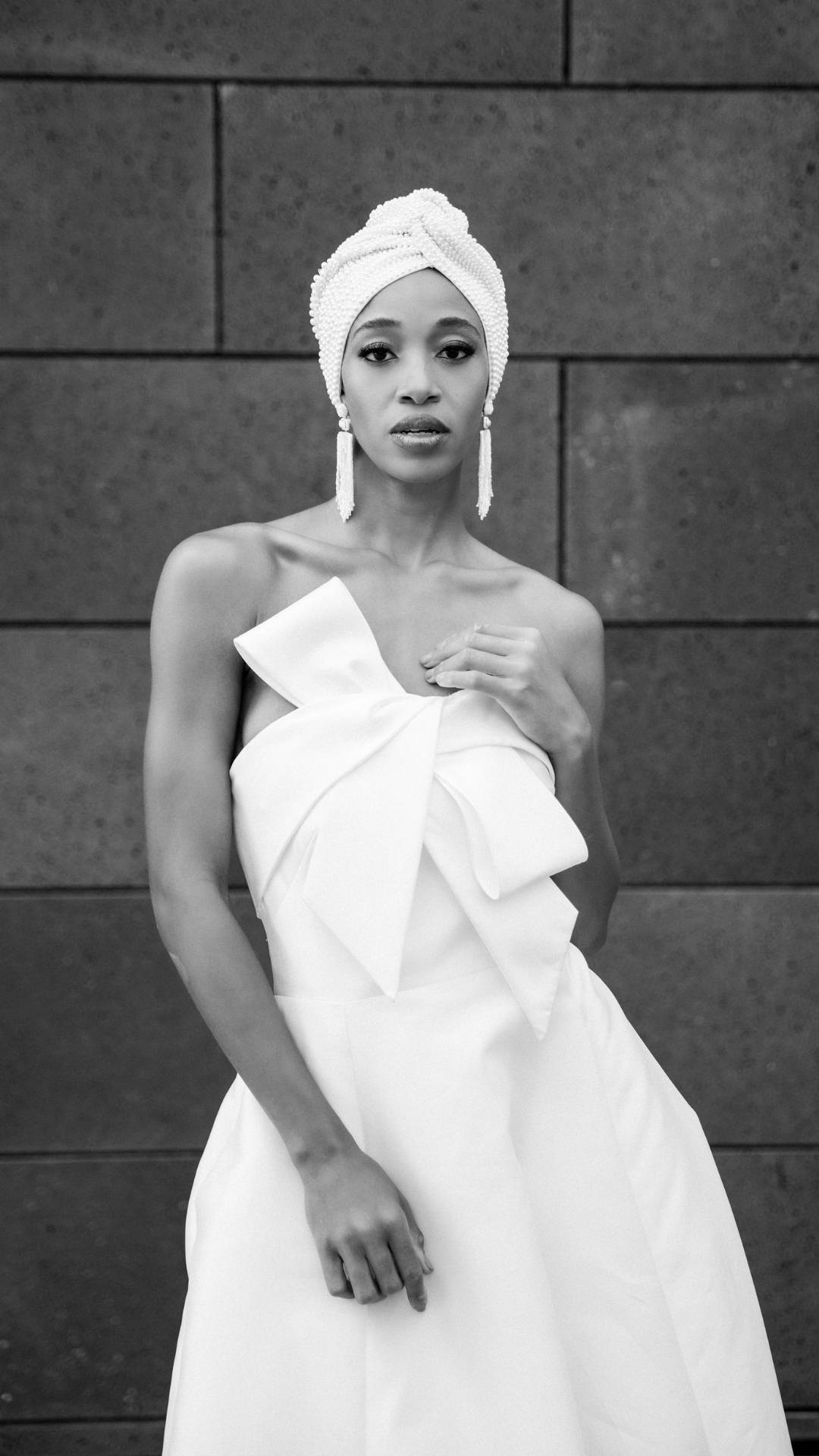
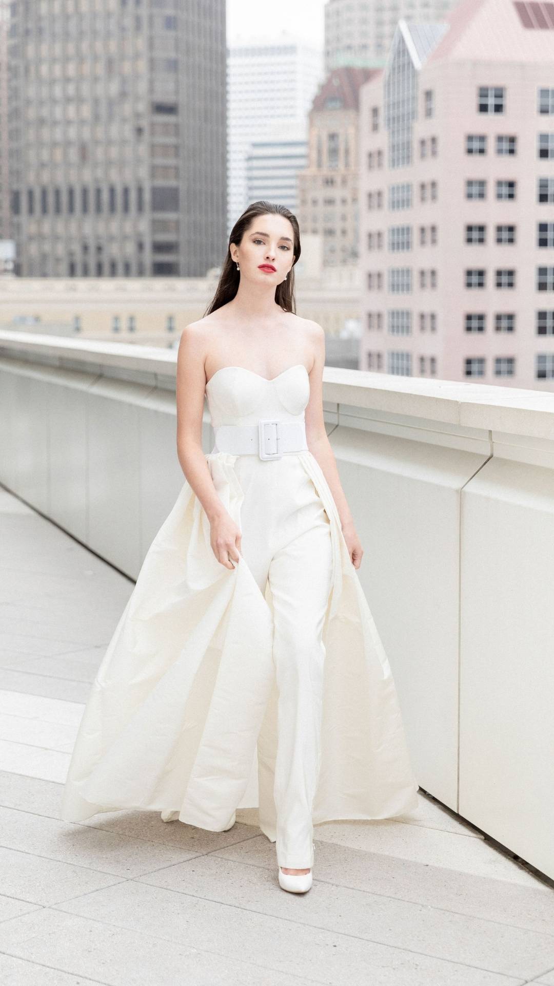
Set in the heart of The Golden City is the San Francisco Museum of Modern Art, a collection devoted solely to art from the 20th century. This was the setting that inspired photographer, Larissa Cleveland and event designer, Jesse Tombs and several other Bay Area creatives to construct a dreamy, high-fashion styled shoot. We spoke with Jesse to get the full story behind this captivating wedding inspiration. Read what she had to say below:
Q: How did this styled shoot first get started?
A: Larissa and I had been really wanting to do something creative. After many months isolated inside our homes alone, and with most if not all of our weddings being postponed, we really wanted to get our hands dirty and collaborate on something beautiful. Larissa and I are always talking about creative ideas we have and locations we want to work at, as well as outfits and dresses we wished our clients would wear at real weddings. Styled shoots are ways of trying out new ideas, taking risks and playing with ideas that some clients might not want to risk on their actual wedding day. When the MOMA said they were interested in working with us, it was a no-brainer. With Larissa being a fine arts major and both of us with a huge passion for art and the architecture of the building, we were thrilled to collaborate with them. I had done the first wedding at the MOMA in 2018, and had not been able to really share images of the wedding due to copyright issues with some of the artwork in the photographs, so I was thrilled to get another chance to work at such a historic and magnificent place, with such a wonderful and creative group of collaborators.
Q: What was the inspiration for the theme/style of the shoot? How did the location of the shoot influence it?
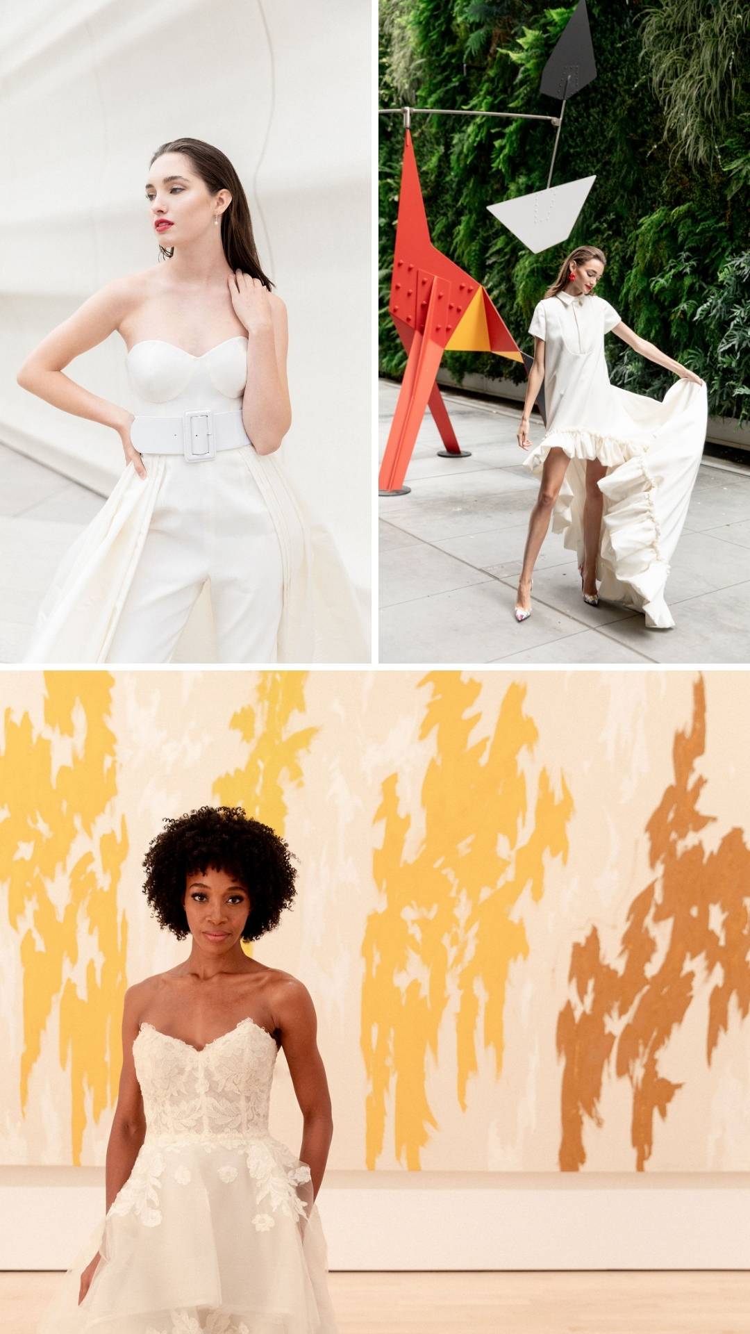
A: Larissa had done a lot of work with fashion and had a lot of really interesting ideas with the dresses. We knew we wanted to play in several areas of the MOMA to get a lot of coverage. With so many unique and interesting venues within the building, we were like kids in a candy shop and wanted to create several looks that all fit within each area of the building. We didn’t only want the styled event set-ups to feel consistent with the space, but also with the art and the fashion that had been selected, so it was kind of a three-tiered process to align all the elements and make sure there was a constant voice in each space.
Q: Tell us about the reception look. What elements were included and why?
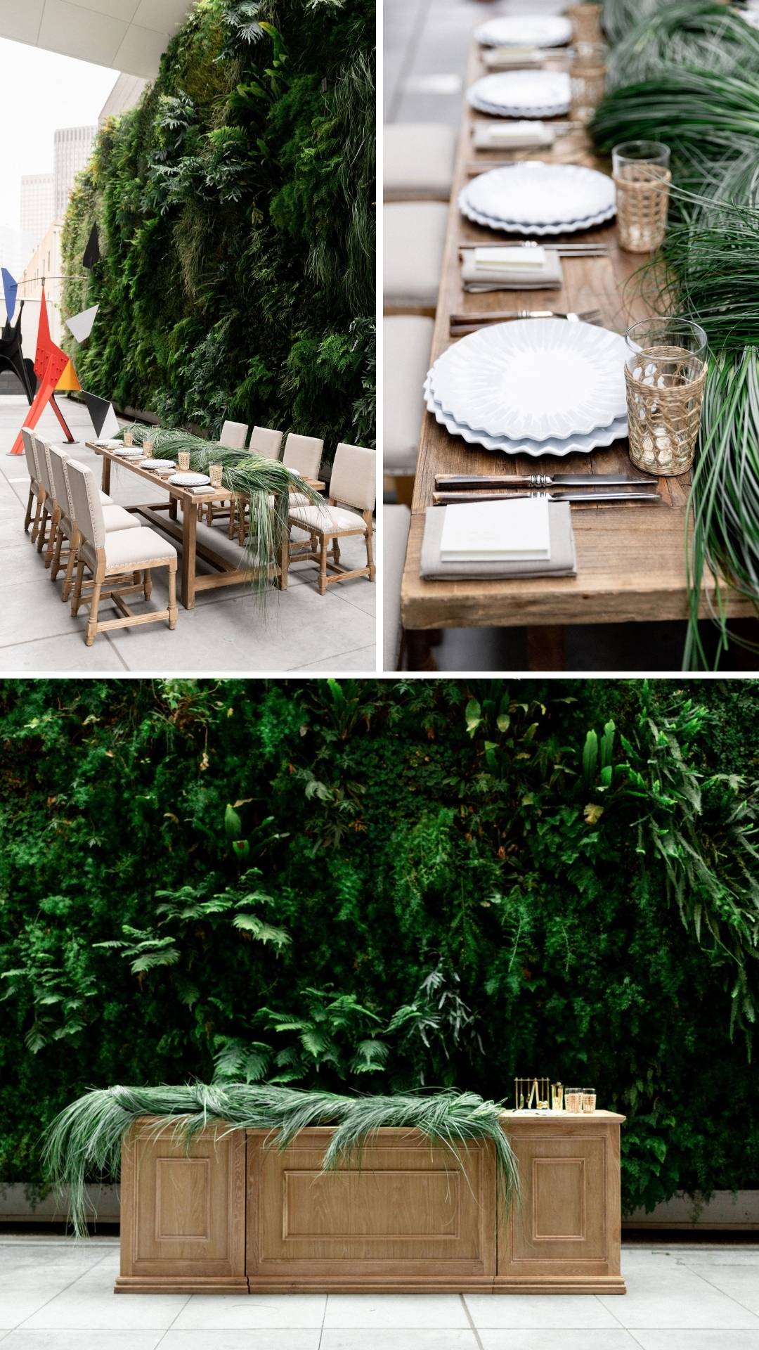
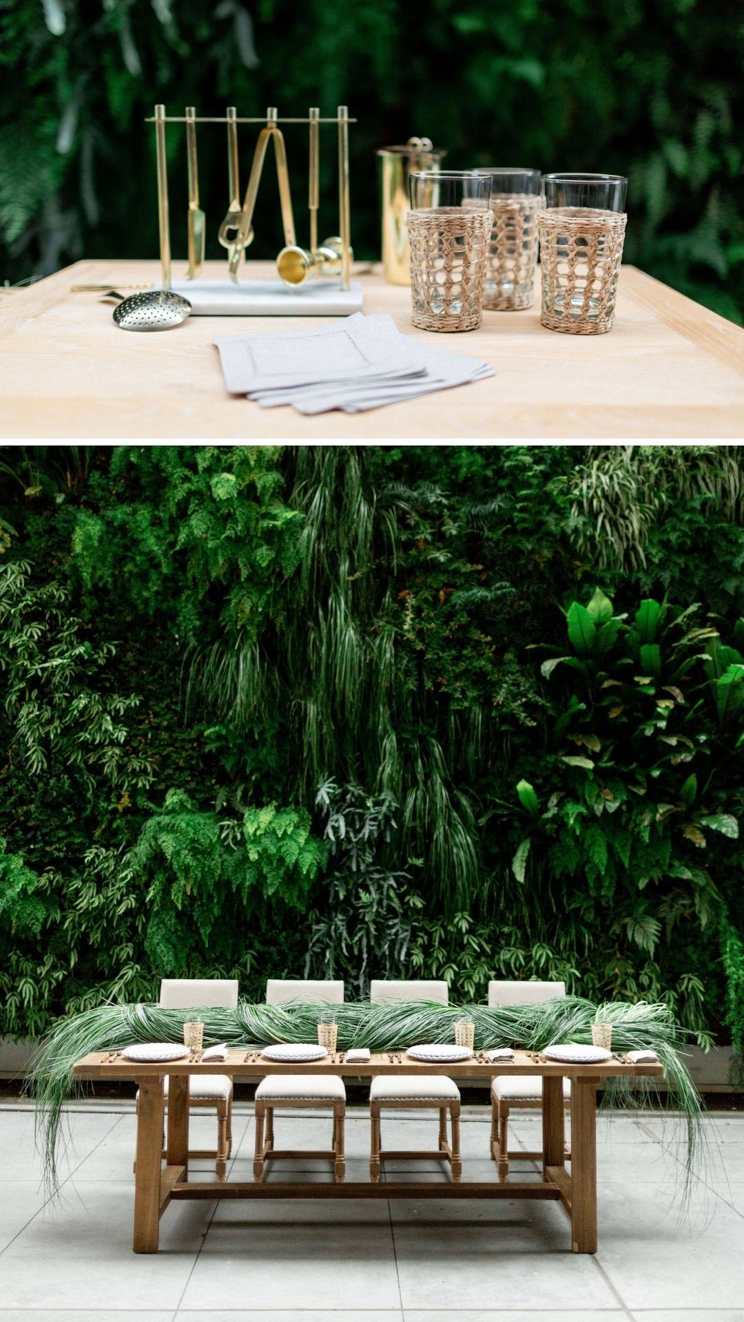
A: Green Wall with Calder:
When in the living wall breezeway, both Amanda from Studio Mondine and I had a vision of the table almost feeling as if it had grown from the wall. This inspiration led to many discussions on how to make the floral elements on the dining table and the bar feel consistent with the space, while still feeling sleek and sculptural. We played around with many ideas and then on the day of the shoot, Amanda braided these huge bundles of grasses into one long arrangement down the center of the table. The mix of wood and pottery with the cane and bone accents lends a natural but sophisticated vibe, being outside, we didn’t want the look to feel super formal. Thus goes well with the playful and youthful bride in the space.
Candles on Stairs with Oscar Dress:
I have always been obsessed with the wooden stairs of the SF MOMA, they are a much a piece of art and a gathering place as the rest of the museum. They have always reminded me of the stairs of a theater or the fashion displays of the Prada store in Soho, New York. They are striking in a way, and feel sculptural and are a place I knew we wanted to shoot in. We covered the stairs in a few hundred candles (artificial of course, as we couldn’t lite real candles in a museum. The final look with the Oscar dress is regal, but the thing I loved the most was when the model took off her shoes. This made it feel more editorial and approachable and took it to the next level in my opinion.
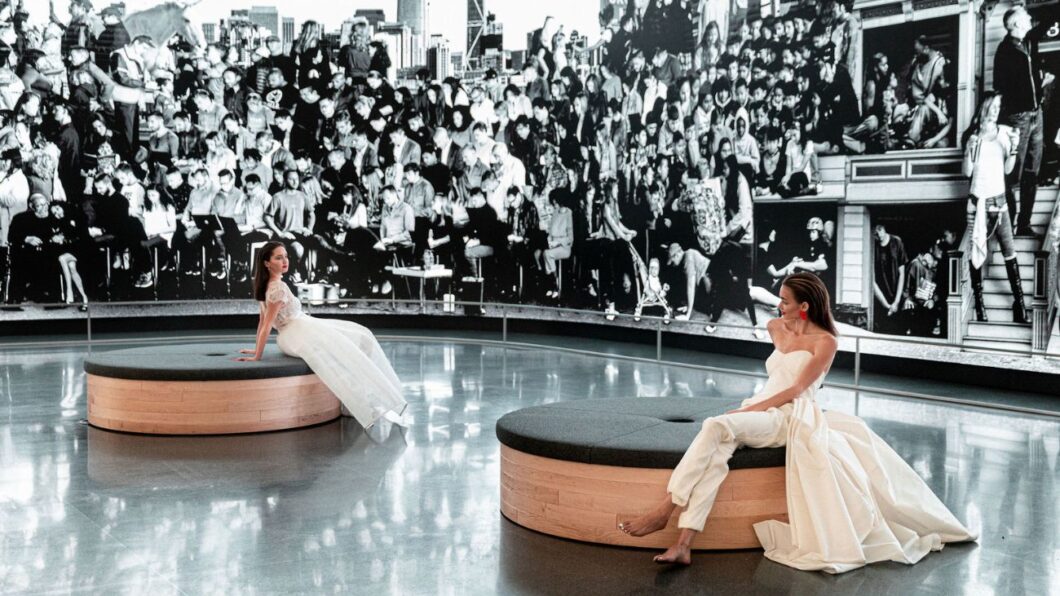
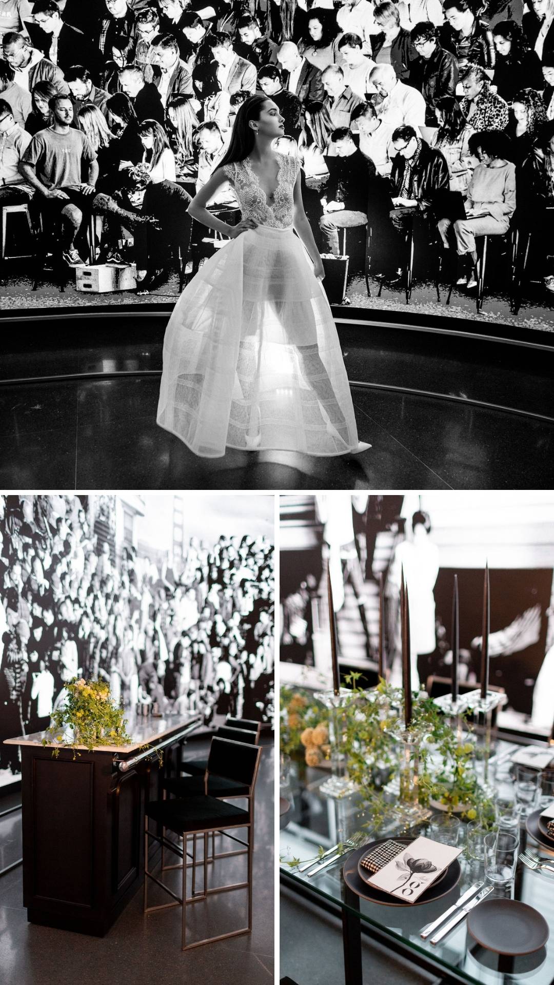
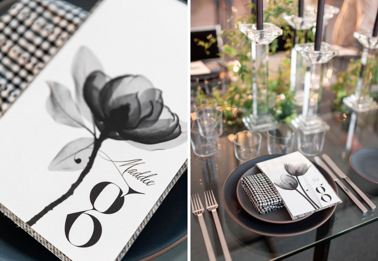
Transparency Table:
The Chronicles of San Francisco, a moving photo mural by the artist JR was always something I had been in awe of. It showed subtle movement, and portraiture in a new form with all walks of life represented. To me, there was also a form of transparency in this piece of art, a clearness and sharpness. I worked with Yonder Design to come up with something that incorporated the black and white nature of the piece. Julie from Yonder Design came up with the X-ray flower, which I thought really captured the mood and environment of the work of art, while still feeling wedding-related and artistic, also subtle enough to not compete with the art. The clear table and low-profile black chairs from Theoni almost disappear in the space.
Q: What was your favorite part of the shoot and why?
A: I think my favorite part of the shoot was just seeing and collaborating with vendors that I know and love. My friends. After such a tough year, it was fun and exciting to be with people I admire and revere in my industry, and do something fun together, and be creative in a safe place with one another.
Vendors: Photographer: Larissa Cleveland; Creative Director: Jesse Tombs; Floral Design: Studio Mondine; Venue: San Francisco Museum of Modern Art; Furniture & Tabletop Decor: Theoni Collection; Paper Design & Branding: Yonder Design; Beauty: Sherrie Long; Dress Designers: Naeem Khan, Viktor and Rolf, Alex Perry, Oscar de la Renta, Lela Rose and Carolina Herrera; Shoes: Christian Louboutin; Atelier: Jin Wang Bride; Tux: The Black Tux; Catering: Paula Le Duc Fine Catering & Events; Models: Cast Images


